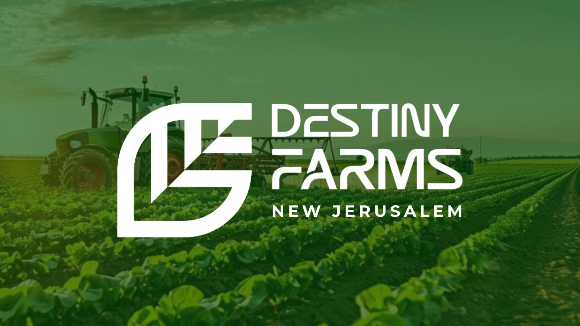
The Vision: Agriculture Meets Elite Authority Destiny Farms New Jerusalem is not just about the soil; it is a sanctuary for lifestyle excellence and leadership. Reliable Web Development was tasked with creating a brand identity that captures the land’s potential and transforms it into a visual language for agri-tourism and spa wellness. This Brand Identity Guide outlines the visual standards and creative philosophy required to maintain a consistent, prestigious, and authoritative presence across all professional platforms. The Foundation: This document serves as the official Brand Identity Guide for Destiny Farms New Jerusalem. It outlines the visual standards and creative philosophy required to maintain a consistent, prestigious, and authoritative brand presence across all professional platforms. Destiny Farms New Jerusalem exists to foster lifestyle excellence and agricultural leadership. The platform identifies and captures the land’s potential, transforming it into a tool for community and luxury success through agri-tourism and spa wellness. By centering the brand on Rejuvenation and Training, we move the perception of the business from a simple farm to an Empowerment Hub. This section introduces the core visual engine of the brand. In business psychology, the first glimpse of the logo must be framed as a “Strategic Asset” rather than just a drawing. We are setting the stage for the technical breakdown that follows. We engineered an abstract emblem that serves as a powerful metaphor for growth: a vibrant green pathway to prosperity, cradled and protected by the fertile earth. This path ascends purposefully toward a sanctuary of wellness and tourism, representing the pinnacle of communal health and the realization of a sustainable lifestyle. A Reliable brand must be functional. This page demonstrates the “Clear Space” rules, ensuring the Destiny Farms identity is never crowded or distorted. This mathematical precision signals to stakeholders that the business is managed with order and high-level attention to detail. This marks the transition from shape to emotion. By dedicating a full section to the palette, we show the client that every color choice is a calculated business decision designed to trigger a specific psychological response in the consumer. Lush Agricultural Green: This primary shade is more than a color; it is a signal of vitality, organic freshness, and the abundance of the harvest. It connects the consumer directly to the life-giving nature of the farm. Typography is the “tone of voice” of your business. In business psychology, how you present text determines if a client sees you as a Reliable professional or an amateur. This section prepares the reader for the font selection that commands authority. Primary (Nevera Regular): Used for titles to command immediate respect and signal established heritage. This is the “Conversion Phase” of the blog. We move from theory to reality. Showing the brand in its physical environment triggers the Visual Narrative in a client’s mind, allowing them to see the brand as a living, breathing success. Here, we see the green and white identity integrated into the estate. The clarity of the design ensures that even from a distance, the brand looks elite and organized. This is Risk Mitigation—showing the client exactly how their investment will look in the real world.